Disclaimer:
This is not a real product and service. This is a case study of a mock-brief demonstrating the research, challenges, thinking, decision making and outcomes involved in my UX and UI process.
Overview:
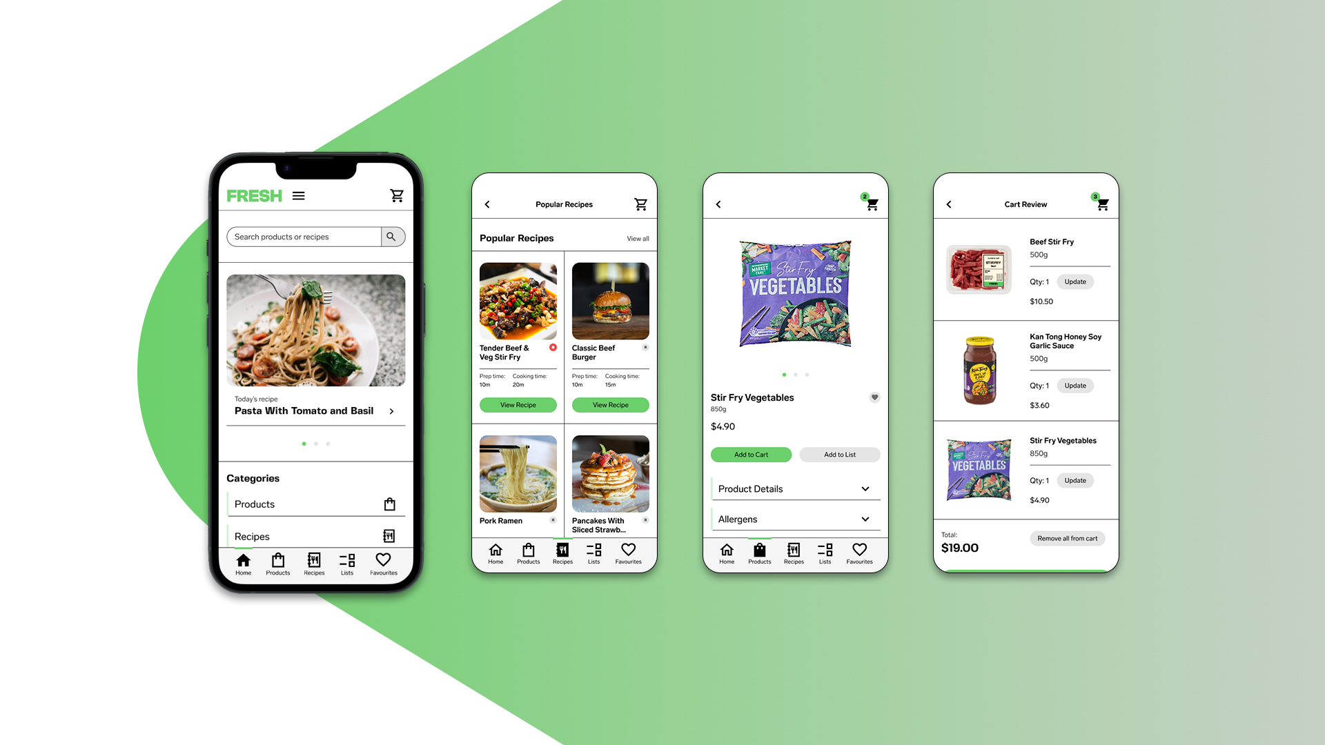
FRESH is a mobile grocery app designed for busy people who value convenience and efficiency. The brief challenged me to create a streamlined shopping experience that balanced speed of use with flexibility, offering tailored product recommendations and recipe suggestions. For this solo project, using the double diamond design model, I conducted UX research, created prototypes for user testing and developed a basic design system paired with a series of Hi-fidelity UI screens to illustrate how the finished product looks and functions. The result of this process was a minimalist mobile app where test users were able to easily browse, select, and purchase groceries in just a few taps.
Read Case Study ↓
View Video Prototype ↓
This is not a real product and service. This is a case study of a mock-brief demonstrating the research, challenges, thinking, decision making and outcomes involved in my UX and UI process.
Overview:
FRESH is a mobile grocery app designed for busy people who value convenience and efficiency. The brief challenged me to create a streamlined shopping experience that balanced speed of use with flexibility, offering tailored product recommendations and recipe suggestions. For this solo project, using the double diamond design model, I conducted UX research, created prototypes for user testing and developed a basic design system paired with a series of Hi-fidelity UI screens to illustrate how the finished product looks and functions. The result of this process was a minimalist mobile app where test users were able to easily browse, select, and purchase groceries in just a few taps.
Challenges:
FRESH wanted their product to make grocery shopping, an activity that many consider a chore, as easy and convenient as possible. The app had three main objectives:
The challenge was to develop a user experience, and complimentary user interface, that coherently tied these three objectives together.
FRESH wanted their product to make grocery shopping, an activity that many consider a chore, as easy and convenient as possible. The app had three main objectives:
- To have a simple, intuitive ordering process in which minimal steps were required to complete an order.
- To personalise, based on their selection, the user experience by offering users highly relevant product suggestions that would make shopping easier.
- To reduce the stress of meal planning and meal preparation by offering users recipes.
My contribution:
Using the Double Diamond design methodology, I conducted UX research, created and tested prototypes, developed a basic design system and delivered a series of Hi-Fidelity screens, illustrating three examples of how an end user could navigate the app and efficiently order groceries. Below is a detailed write up of the steps involved in the process, the challenges I faced, and how I overcame them.
Using the Double Diamond design methodology, I conducted UX research, created and tested prototypes, developed a basic design system and delivered a series of Hi-Fidelity screens, illustrating three examples of how an end user could navigate the app and efficiently order groceries. Below is a detailed write up of the steps involved in the process, the challenges I faced, and how I overcame them.
Clarifying context & making assumptions:
Before starting the project, I analysed the brief and completed a context clarifier to help define the objectives for the project. From this I defined success as: “Using minimal steps, a user should be able to quickly order grocery items and find new recipe ideas”. Based on initial assumptions I created a proto-persona, imagining the goals of an end user and the pain points that might come from using online grocery shopping services.
Before starting the project, I analysed the brief and completed a context clarifier to help define the objectives for the project. From this I defined success as: “Using minimal steps, a user should be able to quickly order grocery items and find new recipe ideas”. Based on initial assumptions I created a proto-persona, imagining the goals of an end user and the pain points that might come from using online grocery shopping services.
UX Research - Desk Research:
I conducted a landscape review into the online grocer space, looking at similar products and services in order to gain an understanding of how these services worked, what they offered and what an end user could expect from one. I decided to compare and contrast multiple mobile apps, giving myself the ‘user task’ of ordering ingredients for a basic beef stir fry dish. I documented the simplest user flow for completing the ‘user task’. Key insights from my landscape review included:
I conducted a landscape review into the online grocer space, looking at similar products and services in order to gain an understanding of how these services worked, what they offered and what an end user could expect from one. I decided to compare and contrast multiple mobile apps, giving myself the ‘user task’ of ordering ingredients for a basic beef stir fry dish. I documented the simplest user flow for completing the ‘user task’. Key insights from my landscape review included:
- Most services provided users with multiple ways of ordering grocery items – There are multiple ways to complete the ‘user task’.
- Most services organised products into categories, subcategories, and sometimes further nested categories.
- Some of these services have dedicated recipe sections, however the navigation to these sections was not visible upon home load - the user would have to find it.
- Some services recommended users similar products (e.g If a user was looking at a particular beef product they might be recommended alternative beef products), whereas others recommended complimentary products (e.g If a user was looking at beef products they might be recommended noodles, hamburger buns etc).
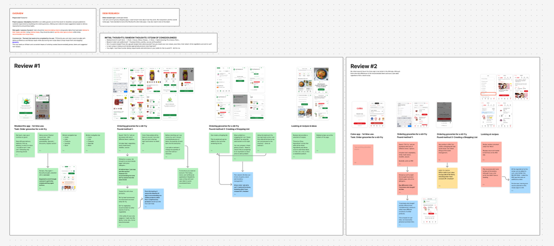
UX Research - Interviews & Data synthesis:
I conducted interviews with people who used or had used grocery shopping apps. Key questions included:
I conducted interviews with people who used or had used grocery shopping apps. Key questions included:
- What people use these apps for?
- Why people use these apps?
- How people felt about the overall experience?
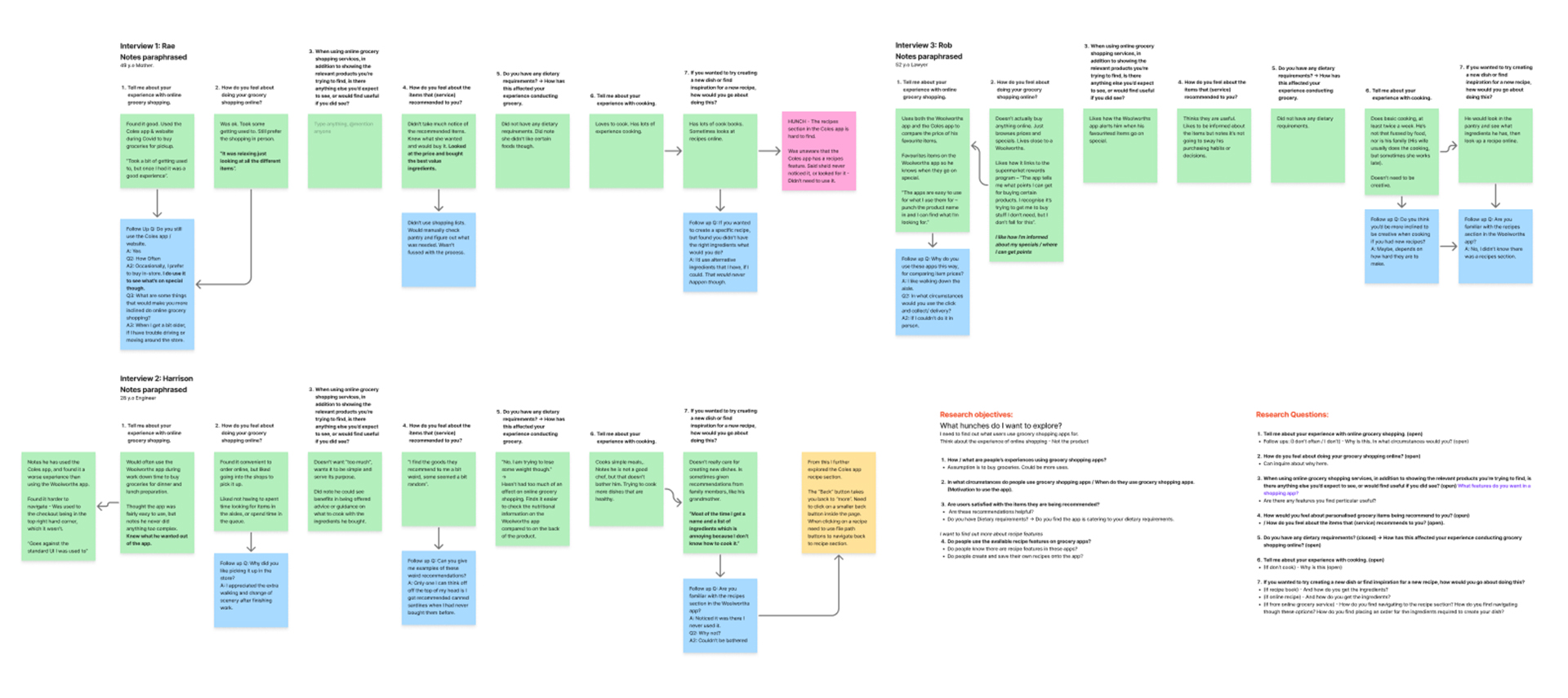
I documented their responses and created an affinity map to categorise the data and help illustrate overlapping responses. The data presented the following key insights:
- People use these services for various reasons. Some people used the services to purchase groceries; some people only used them to browse items and check prices. This insight would be critical in informing the User Experience, particularly the layout of the product pages and the information provided.
- Many found the interfaces overwhelming due to excess promotional content.
- People were unaware that the services had recipe sections.
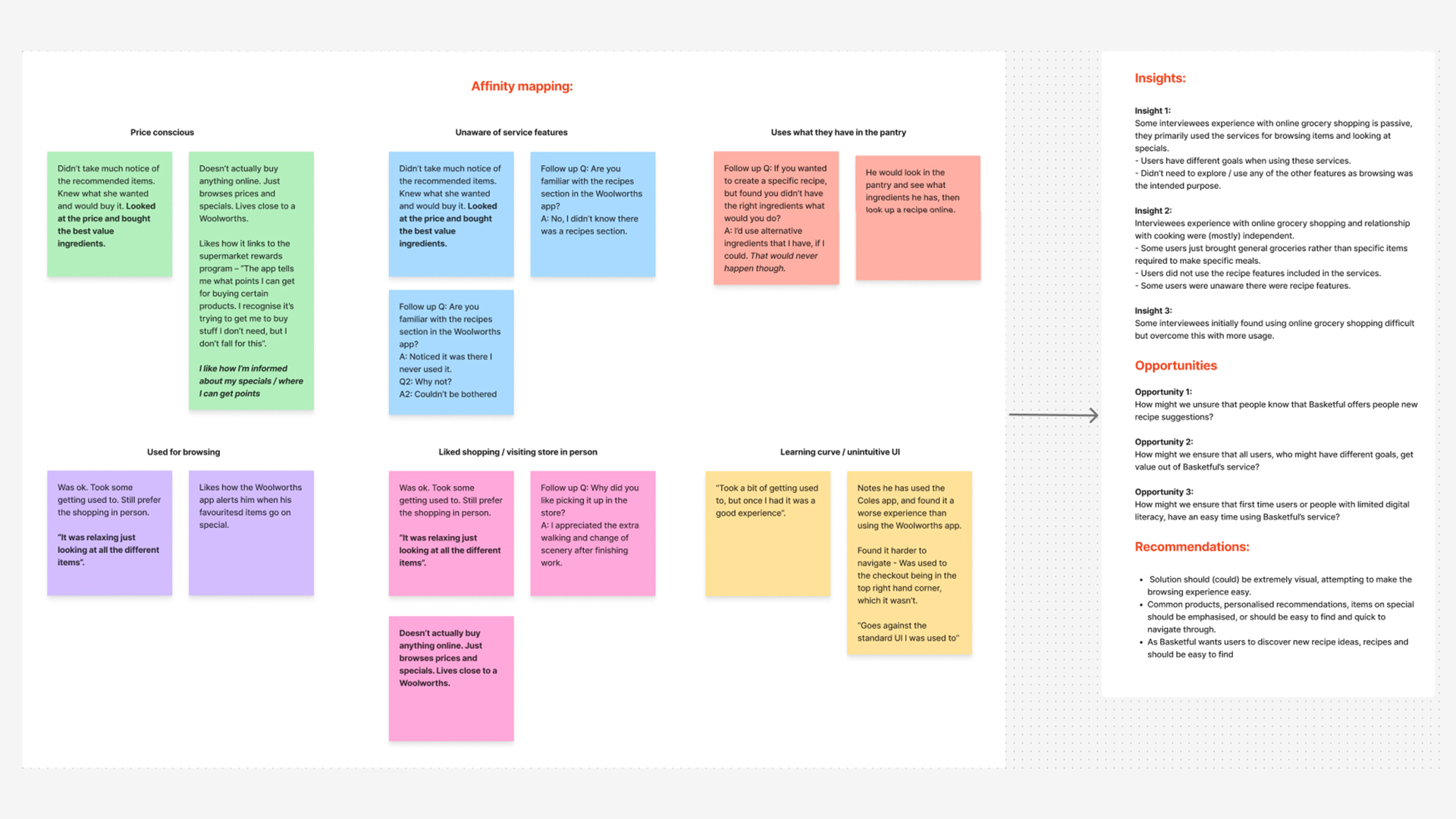
Based on the research, I developed the following recommendations, which would act as the pillars informing the User Experience design going forward.
- Solutions should accommodate for multiple types of users, including both people who are looking to buy and people who just want to browse.
- In line with FRESH’s objectives, solutions should ensure the recipe section is easy to find.
- Solutions should be simple, clear and not contain any unnecessary information in order to lower the barrier to entry, flatten the learning curve and streamline the shopping experience.
UX development - Ideation & Prototyping:
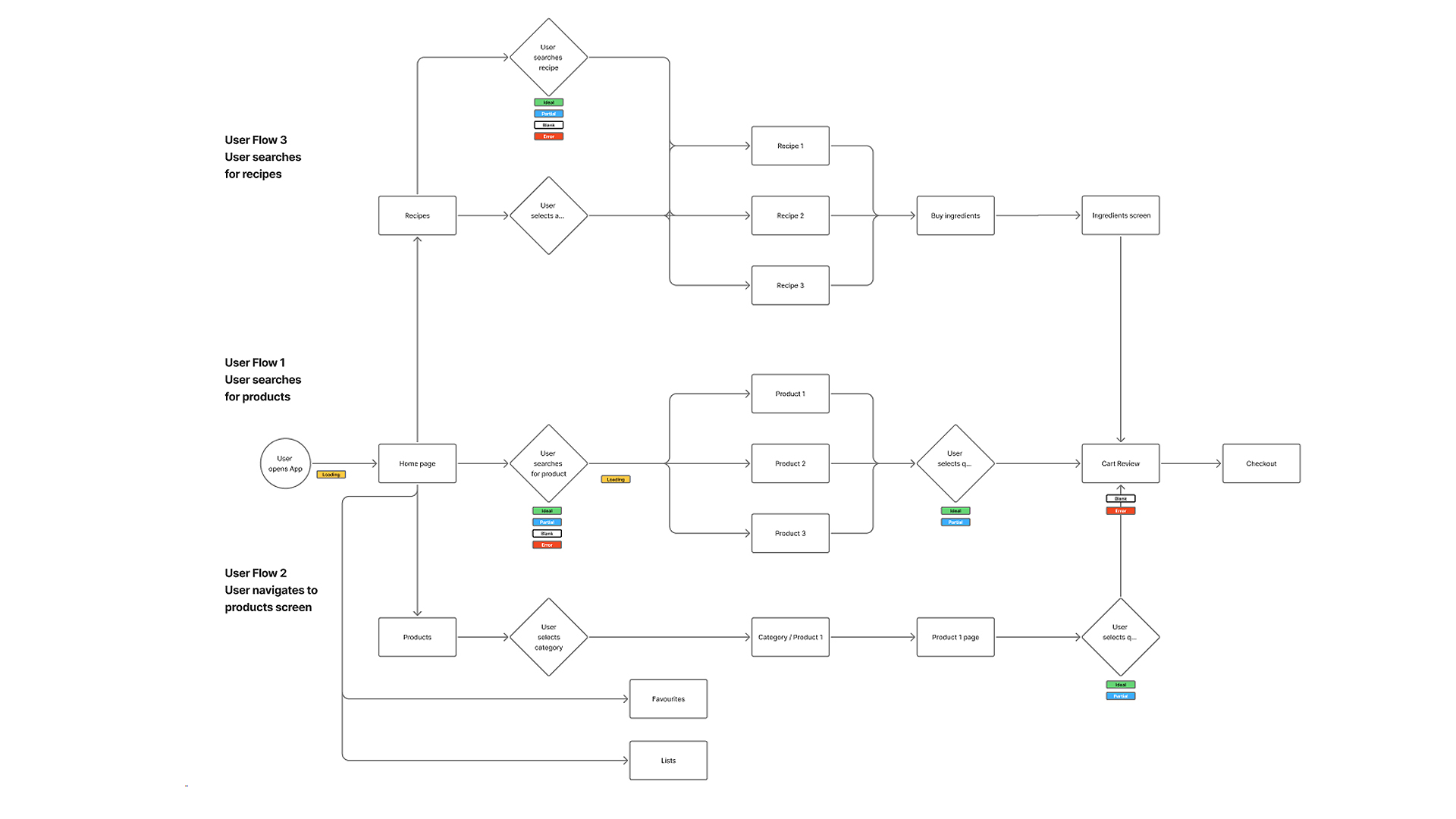
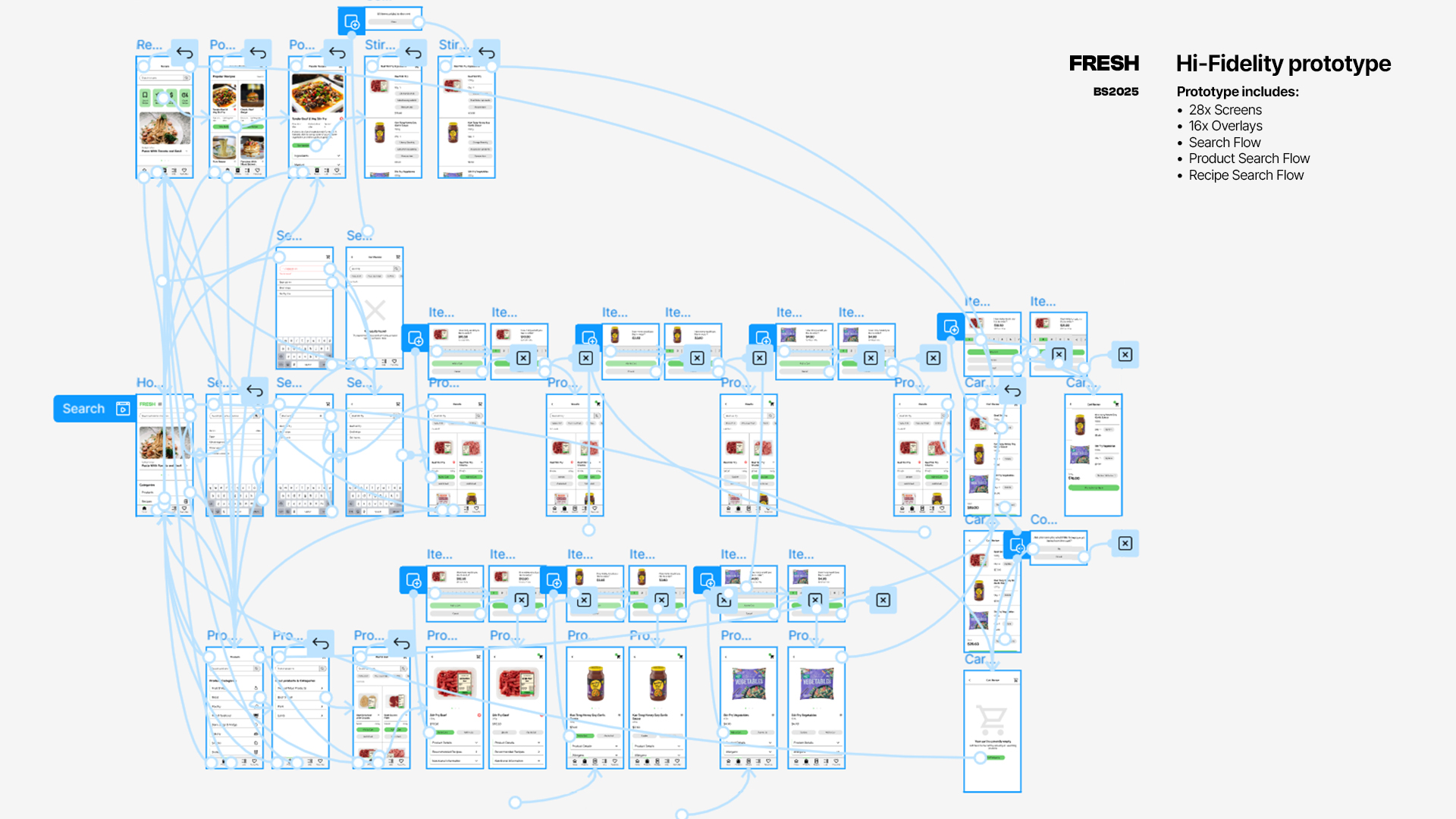
Using ideation techniques, such as brainstorm, storyboarding and crazy 8s, I generated ideas for the opportunities I identified. After prioritising my ideas with an Impact-Effort matrix, I created a user flow diagram to capture the different ways a user could complete my ‘user task’ of ordering ingredients for a simple beef stir fry.
Using ideation techniques, such as brainstorm, storyboarding and crazy 8s, I generated ideas for the opportunities I identified. After prioritising my ideas with an Impact-Effort matrix, I created a user flow diagram to capture the different ways a user could complete my ‘user task’ of ordering ingredients for a simple beef stir fry.
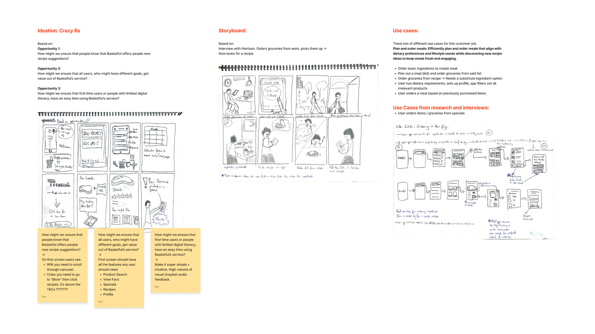

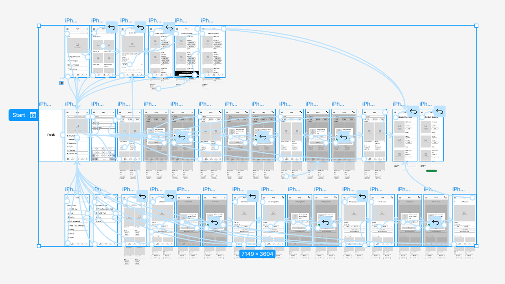
From this, I created wireframes of the different screens involved in the user flow before creating a paper prototype and a low fidelity digital prototype to perform moderated testing with some users. Based on participant feedback the prototype revealed that:
- Participants did not always click on the search bar to looks for products – They did not follow the ‘Happy Flow’ that I had scripted for the ‘user task’. Some preferred to look for items through the products page.
- Validation for items being added to the cart should be implemented.
- Participants wanted more control when ordering items – If they accidently clicked on a product they didn’t want, they wanted the ability to stop an item being added to the cart. When ordering from a recipe screen, they suggested it would be useful if they could add all the items to the cart.
- Some participants were dissatisfied with the personalised language I had used in the prototype. “At the end of the day, I don’t care if the app says hello to me or not, I need it to help me buy groceries”.
UX thinking – Critical decisions:
The research, iterative design process, prototyping and moderated user testing informed serval key decisions when designing the user experience for FRESH’s service.
The research, iterative design process, prototyping and moderated user testing informed serval key decisions when designing the user experience for FRESH’s service.
- Formatting content into lists and two column structures to make it accessible, easy to use and navigate through, and accommodate for users who are just browsing.
- Having an “Add to Cart” button under each item on the product feed pages, allowing users the ability to quickly add multiple products to their cart from a single screen.
- Having the products page include both complimentary items (“people also bought”) and similar products (“you might like”), to offer users another method of navigating through the ordering process.
- Recommending recipes to users based on products they are browsing or purchasing – This helped tie together FRESH’s three main objectives.
- Having specific buttons that could change the quantity of product, filter search content, remove all items from the cart and add all items to the cart. This offered users the flexibility in order and search options that consumers expect, while also enhancing the efficiency of the user experience in some use cases.
UI Development:
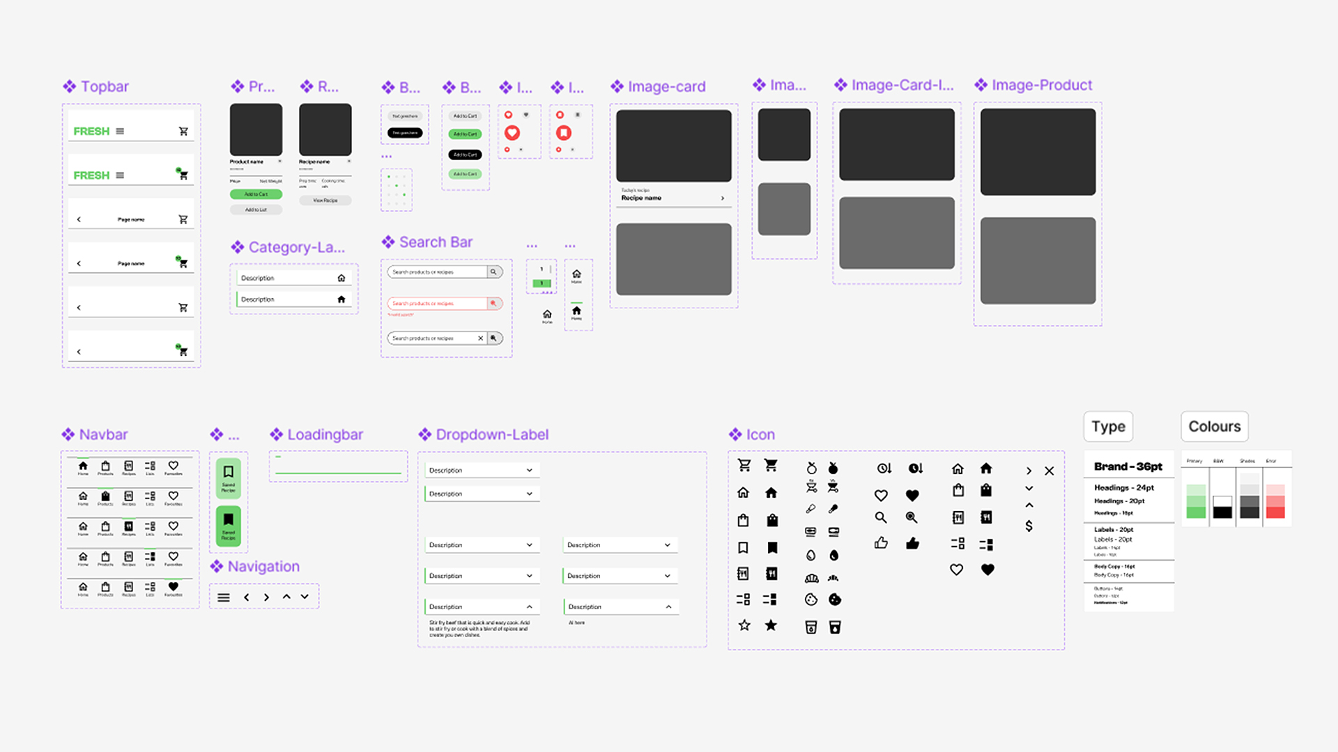
Having tested the different user flows, I began building a High-Fidelity prototype. After some initial research and conceptualisation, I decided that the user interface and overall aesthetic of the app needed to compliment FRESH’s brand values convenience and efficiency. I created a moodboard documenting my research, serving as a visual reference for screens, componentry and overall look and feel.
Using the Atomic Design Methodology, I built a basic design system consisting of typefaces, colours, icons, image cards and button styles. These elements were then combined to build the components that would be used in the design system, accounting for the various states within specific component UI stacks.
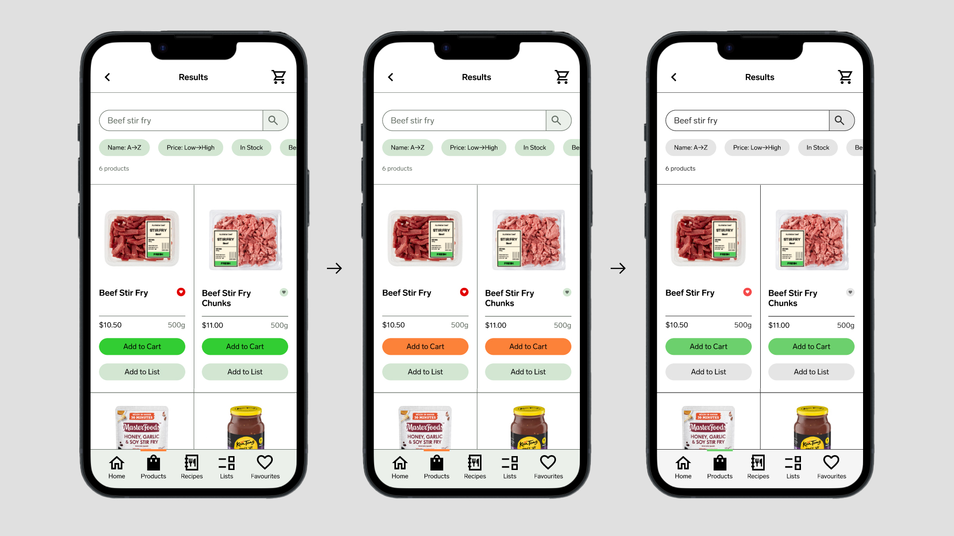
Managing colour usage presented a challenge in this project, the palette went through several iterations. Originally, in line with the minimalist theme, I only introduced various shades of green to the design, however, upon review the restrictive palette didn’t create an easily readable, distinct visual hierarchy - Some components blended together, the CTA buttons weren’t being emphasised, the lighter, pastel shades didn’t follow best accessibility practises, and I was worried that the pastel green buttons might be seen as ‘inactive states’ of the vibrant green buttons.
In a second iteration, after experimenting with a few different colours, I introduced a complementary orange to help highlight the CTA elements. Test users had mixed views about this inclusion, some noted it helped create a more distinct visual hierarchy, others found it confusing that the orange button, associated with waiting or slowing down in traffic systems, was the main CTA button whereas the green, associated with ‘go’ in traffic systems, was being used for secondary CTAs. After some critical thinking I decided to remove the orange from the UI’s palette, refocusing the aesthetic on minimalism and simplicity. I introduced black and tones of grey into the design and used the vibrant, primary green sparingly to heighten its importance. Now only using one colour I further established the UI’s hierarchy through the spacing and distribution of elements, ensuring they were tight to reflect efficiency, but spaced far enough apart to be legible.
In a second iteration, after experimenting with a few different colours, I introduced a complementary orange to help highlight the CTA elements. Test users had mixed views about this inclusion, some noted it helped create a more distinct visual hierarchy, others found it confusing that the orange button, associated with waiting or slowing down in traffic systems, was the main CTA button whereas the green, associated with ‘go’ in traffic systems, was being used for secondary CTAs. After some critical thinking I decided to remove the orange from the UI’s palette, refocusing the aesthetic on minimalism and simplicity. I introduced black and tones of grey into the design and used the vibrant, primary green sparingly to heighten its importance. Now only using one colour I further established the UI’s hierarchy through the spacing and distribution of elements, ensuring they were tight to reflect efficiency, but spaced far enough apart to be legible.

Outcome:
The outcome of this project was a High-Fidelity prototype for FRESH’s app, centred around an efficient, convenient, minimal interaction ordering process. Test users found the user experience simple and enjoyable. They were easily able to browse through the different screens, intuitively understand what buttons or elements did and complete the ‘user task’, either through the search bar, products screen or recipe section.
The outcome of this project was a High-Fidelity prototype for FRESH’s app, centred around an efficient, convenient, minimal interaction ordering process. Test users found the user experience simple and enjoyable. They were easily able to browse through the different screens, intuitively understand what buttons or elements did and complete the ‘user task’, either through the search bar, products screen or recipe section.