Disclaimer:
This is not a real product and service. This is a case study of a mock-brief demonstrating the research, challenges, thinking, decision making and outcomes involved in my UI process. This mock-brief expands on some existing User Experience research.
Overview:
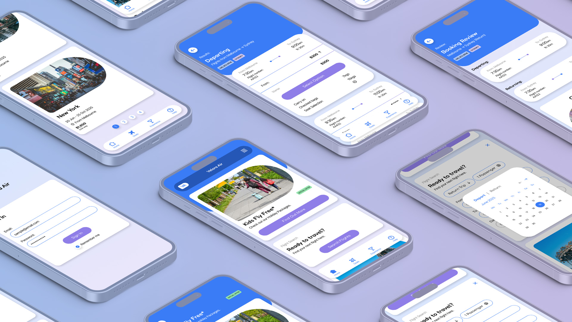
Velora Air is a fictional airline brand that promotes comfortable, economical flights. The brand was looking to capitalise on some recently completed UX research by completing the UI design for their mobile app. I was tasked with developing a basic, developer ready design system, series of High-Fidelity screens and overall aesthetic for the Velora Air’s UI so that they could release a MVP (minimum viable product). I conducted UI research, created moodboards and UI flows, developed a basic design system, brand rules and brand aesthetic, and produced numerous hi-fidelity screens illustrating what the finished product looks like. The result of this process was a responsive design system, implemented across a series of mobile screens and a desktop home page, that aesthetically reflected the brand values of Velora Air. Test users liked the overall aesthetic, finding the design intuitive and easily navigable.
Read Case Study ↓
View Video Prototype ↓
This is not a real product and service. This is a case study of a mock-brief demonstrating the research, challenges, thinking, decision making and outcomes involved in my UI process. This mock-brief expands on some existing User Experience research.
Overview:
Velora Air is a fictional airline brand that promotes comfortable, economical flights. The brand was looking to capitalise on some recently completed UX research by completing the UI design for their mobile app. I was tasked with developing a basic, developer ready design system, series of High-Fidelity screens and overall aesthetic for the Velora Air’s UI so that they could release a MVP (minimum viable product). I conducted UI research, created moodboards and UI flows, developed a basic design system, brand rules and brand aesthetic, and produced numerous hi-fidelity screens illustrating what the finished product looks like. The result of this process was a responsive design system, implemented across a series of mobile screens and a desktop home page, that aesthetically reflected the brand values of Velora Air. Test users liked the overall aesthetic, finding the design intuitive and easily navigable.
Challenges:
There were two main challenges for this brief.
The first was that some of the necessary UX was missing – While there were low-fidelity wireframes for the home page, flight deals page, experience page and help page, key screens illustrating how a user would navigate to the checkout were missing. Additionally, there wasn’t a user flow illustrating this process. I felt it was necessary for these screens to be included in the hi-fidelity prototype.
The second was leveraging the existing UX work to build the design system and overall aesthetic. Velora Air had identified an audience that sought comfort, reassurance and affordability. The challenge was to build a UI that resonated with users, while reflecting the values of the airline.
My contribution:
Using the Double Diamond design methodology, I conducted UI research, created moodboards, built UI flows and UI stacks, developed a basic design system and applied it to numerous screens, resulting in a designed, hi-fidelity prototype. Below is a write up of the steps involved in the process, the challenges I faced, and how I tackled them.
Using the Double Diamond design methodology, I conducted UI research, created moodboards, built UI flows and UI stacks, developed a basic design system and applied it to numerous screens, resulting in a designed, hi-fidelity prototype. Below is a write up of the steps involved in the process, the challenges I faced, and how I tackled them.
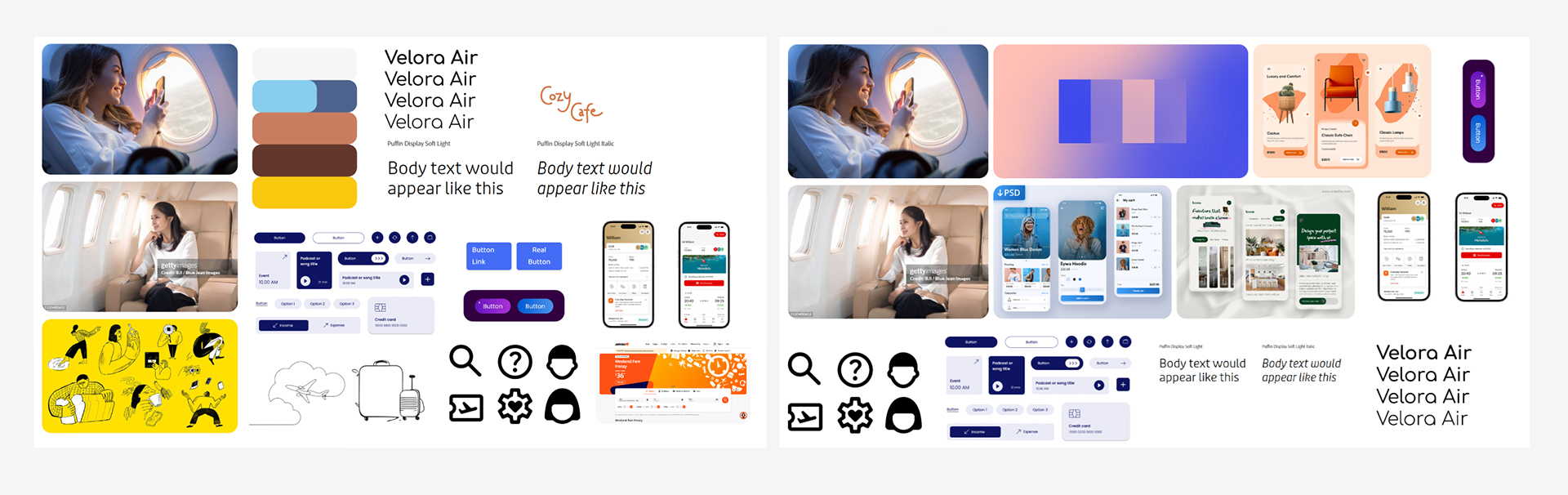
UI Research – Moodboard:
I started the process by gathering visual references and creating a moodboard for the overall brand aesthetic. Under the theme of “Ultra-Comfortable” the moodboard documented colours, typefaces, iconography, imagery, illustrations, componentry and existing products from competitors. This was an ongoing moodboard that went through several iterations as I made critical design decisions and developed insights through user testing.
I started the process by gathering visual references and creating a moodboard for the overall brand aesthetic. Under the theme of “Ultra-Comfortable” the moodboard documented colours, typefaces, iconography, imagery, illustrations, componentry and existing products from competitors. This was an ongoing moodboard that went through several iterations as I made critical design decisions and developed insights through user testing.
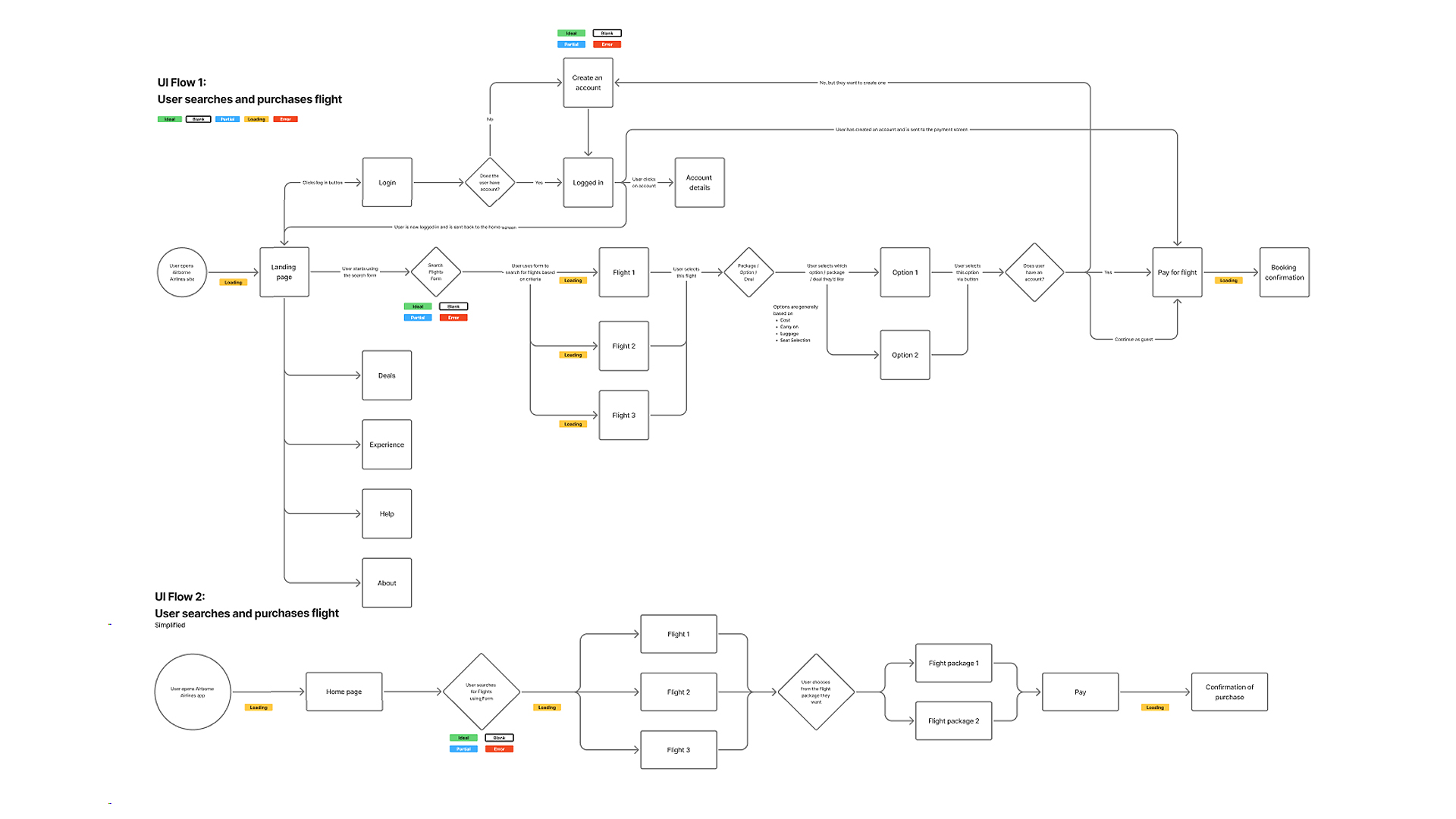
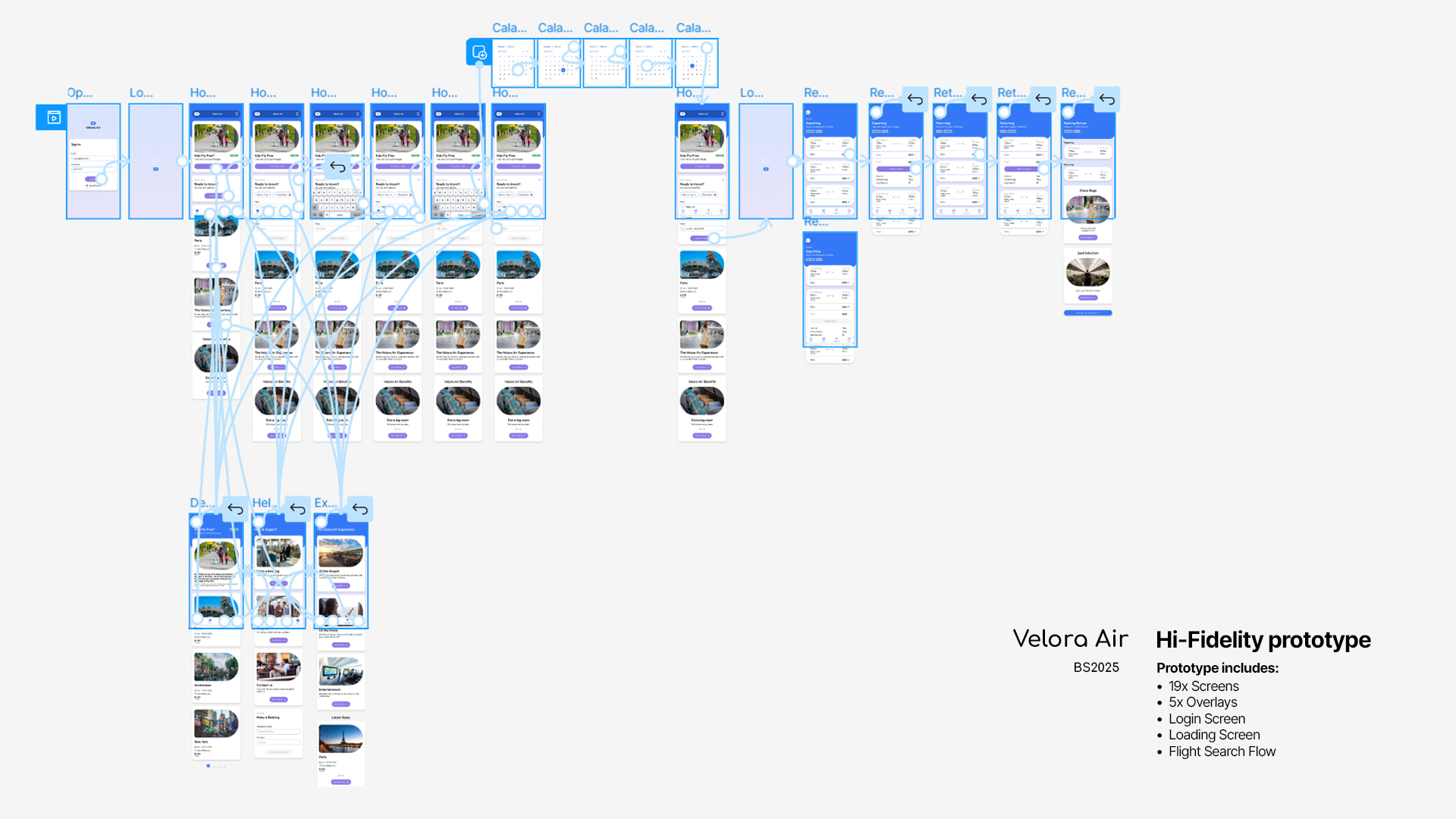
UI Flow:
To explore the problem space and determine what screens would be needed for this prototype, I created a UI Flow diagram illustrating how a user would search, book and purchase a flight. In doing this, paired with Velora Air’s existing UX research, I determined what hi-fidelity screens I would need to produce for the prototype.
To explore the problem space and determine what screens would be needed for this prototype, I created a UI Flow diagram illustrating how a user would search, book and purchase a flight. In doing this, paired with Velora Air’s existing UX research, I determined what hi-fidelity screens I would need to produce for the prototype.
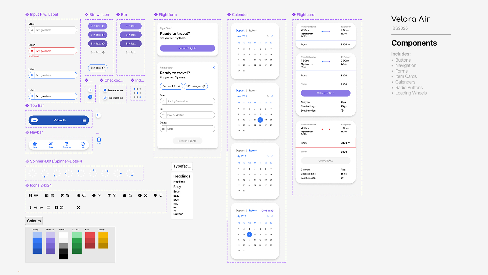
Design System & UI thinking – Critical decisions:
Using the Atomic Design Methodology, I explored different ideas and aesthetics for Velora Air’s design system. After experimenting with different designs, I conducted A/B testing with test users to determine which direction was preferred, then reviewed the overall aesthetic to ensure that every decision reflected the airline’s core values of comfort, reassurance and affordability. This testing and critical review informed serval key decisions when designing the UI for Velora Air’s design system. Some of these key decisions included:
Using the Atomic Design Methodology, I explored different ideas and aesthetics for Velora Air’s design system. After experimenting with different designs, I conducted A/B testing with test users to determine which direction was preferred, then reviewed the overall aesthetic to ensure that every decision reflected the airline’s core values of comfort, reassurance and affordability. This testing and critical review informed serval key decisions when designing the UI for Velora Air’s design system. Some of these key decisions included:
- Using a strong blue as the primary colour to represent security and calmness.
- Including a complimentary purple for CTAs in the palette to reflect the emphasis the brand places on comfort.
- Having all components rounded, include images, buttons, item cards, navigation bars and icons.
- Using a white background for item cards and containers to aid in legibility, paired with a drop shadow to suggest the components were floating – Clouds in the sky.
- Making the heading typeface a rounded sans-serif to reflect brand value, and making the body typeface an accessible geometric sans-serif for legibility and to contrast with the heading font.
- Using a blue to purple gradient for the background of the UI to subtly establish an ethereal mood, suggesting the airline offers a calming, blissful service.


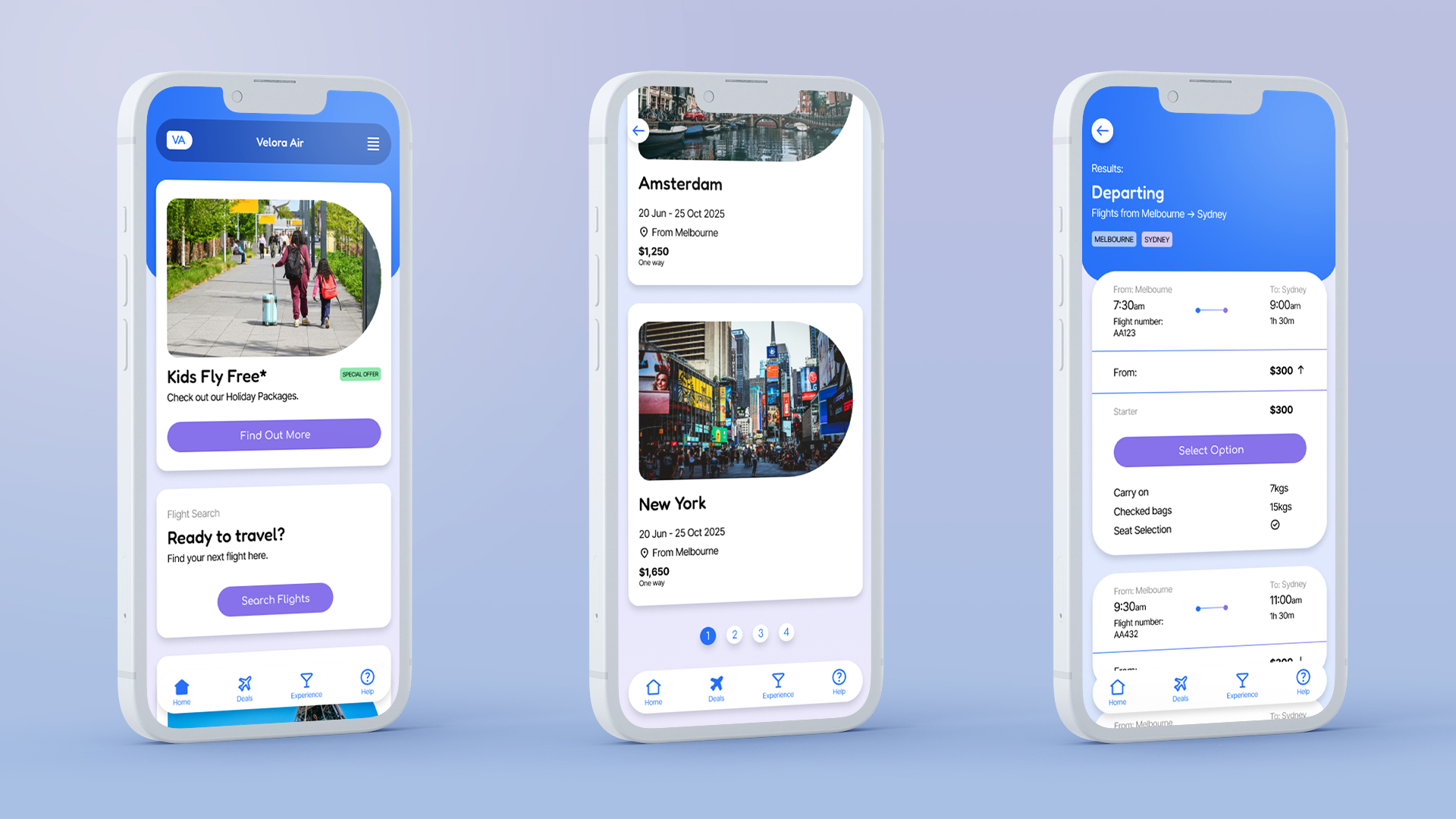
Outcomes:
The outcomes of this project were a high-fidelity prototype for Velora Air’s mobile app, a series of mobile screens illustrating the polished User Interface, a translation of the mobile design to a desktop home page, and a robust design system that complimented the brand’s values. Test users resonated with the User Interface’s aesthetic and overall feel, noting that it was easily navigable, intuitive, modern and pleasant to use.
The outcomes of this project were a high-fidelity prototype for Velora Air’s mobile app, a series of mobile screens illustrating the polished User Interface, a translation of the mobile design to a desktop home page, and a robust design system that complimented the brand’s values. Test users resonated with the User Interface’s aesthetic and overall feel, noting that it was easily navigable, intuitive, modern and pleasant to use.